Results
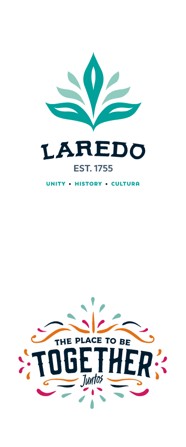
Laredo, Texas is a dynamic destination with a strong community and multicultural pride. The town offers unique experiences and history going back to 1755. Visitors enjoy Laredo’s vibrant culture as they shop, dine and enjoy nature. Relic wanted to highlight the diversity and help Laredo stand out as its own destination in Texas. Relic created a new logo for Laredo, an aloe vera leaf. The logo represents Laredo’s spirit of resilience, like an aloe vera plant in the desert. Its seven individual leaves represent the seven flags Laredo flies each day. The leaves’ northward angle symbolizes the life Laredo gives to the U.S. as. one of the largest ports in the country.
Relic also created a new tagline that builds on Laredo’s brand pillars: “Unity. History. Cultura.” The tagline is a mix of English and Spanish, emphasizing Laredo’s bi-cultural heritage. The campaign reflects harmonious trade between the U.S. and Mexico. Laredo holds a celebration each year with neighboring Mexico where children from both countries share an “abrazo”, or embrace.
Relic sent out a press release about Laredo’s rebrand that was picked up by 119 news outlets. The story received 1,821 views and 248 engagement actions. The sentiment surrounding the story was 100% positive.
GET SIMILAR RESULTS


